Simple and effective UX tips to improve conversion
Article topics
- Remove distractions
- Projecting value
- Shorter forms
- Call-to-action
- Social proof
- Free shipping
- Returns policy
- Final thought
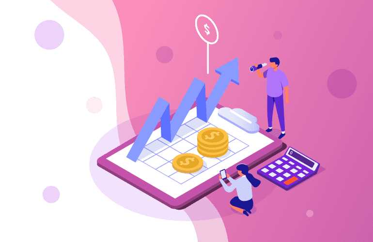
A well-performing webstore will see just under 2% of UK consumers convert. What can you do to help convert some of the other 98%?
The key to improving your conversion rates is to reduce friction in online shopping journeys, boosting user experience (UX). There are many ways this can be achieved. Some of the most effective ways of reducing friction and improving user experiences are the simplest. Sometimes the smallest adjustment, addition or subtraction from a process or user interface (UI) element can make all the difference: streamlining content, clear value proposition, call-to-action (CTA) button placement, leveraging social proof, the list goes on.
This article will explore what you can do to help improve conversion rates without getting bogged down in complicated and often expensive changes to your webstore. The key to making continued, incremental improvements to conversion rates is to make small changes to suspected pain-points and then A/B test to see whether conversion has been improved or not.
Perhaps the most basic thing any business or brand can do to help lift conversions is to improve UX and keep consumers as focused as possible on what they want them to do—what action you want the to take.

1. Remove distractions
We’ve all had the experience of landing on a webpage and not being immediately sure what to do. Whether it’s garish colours, difficult to read fonts or a mess of buttons, links and images, anything that distracts shoppers, anything that detracts from the single task at hand, will cause friction and negative UX.
Landing pages should be concise and intuitive. It should be immediately apparent to shoppers where to click to get the information or product they are looking for. Any webpage should only include information and UI, such as menus, buttons and carousels etc., that are absolutely necessary. Uncluttered pages offer shoppers slicker journeys through your webstore. Using white space between elements on the page will help focus attention on where to click to find what they want, whether that’s finding products, getting information, communicating with your business or sharing your content on social media.
The KISS principle applies here: Keep It Simple Stupid. The simpler, more focused you can make consumer experiences on your webstore, the more likely they will be to convert.
2. Projecting value
It should only take seconds of landing on a webpage for shoppers to understand what it is you are offering. Ensuring that your value proposition is clearly communicated will help to improve conversion.
A value proposition is simply the reason shoppers should buy from you. It’s not a slogan or a tagline, it’s a list of attributes that give your business value for the consumer. Communicating the value that your brand, products or services offer is crucial for maximising conversion rates. The key to communicating your value proposition is to speak plainly to shoppers in a tone of voice that’s in tune with your audience.
Your value proposition should clearly tell consumers what the benefits are of shopping with you—how will your products or service make their lives better? Also tell them what problem your products or services solve, and how your products or services differ from your competitors.
If you are B2B then use your value proposition to tell potential clients what you offer: what does your business do? Why do you do it? What problem does your business solve? What makes your business unique? What geographical location does your business operate in—local, national, international?

3. Shorter forms
Long forms can be a common problem for conversion rates. A consumer gets to a form, begins to fill it in and quickly realises that it’s longer than they were expecting, resulting in them abandoning the form and clicking away.
Form length is a particular pain point during checkout. There is specific information that must be gained from shoppers in order for them to complete the checkout process. But this is only a name, email address, address, and payment details. To help reduce friction at the point of purchase, only ask for the minimum amount of information needed. It’s really useful to have more information, such as sex, age, interests, lifestyle etc. and it’s tempting to try and get this valuable information at the earliest opportunity. But the checkout isn’t the place do this if you want to maximise conversion.
Using a guest checkout enables shoppers to complete their transaction without having to create an account and fill in a longer form. Remember, with a guest checkout you will have the customer’s email address, so additional information about them can be gathered post purchase using personalised, targeted eDM.
When using a form to capture more information than just the essentials, then start the form very simply, getting more involved as the consumer progresses. Break the form into separate pages to lead them through the form, and use a progress bar to show how much of the form has been completed and how much their is left to do. This will help engagement and maximise conversion for those longer, more complex forms.
A HubSpot survey revealed that reducing the number of fields in a form from 4 to 3 increased conversion by 50%.

4. Call-to-action
Call-to-action (CTA) buttons are where consumers click when you want then to take specific action. For example, to tell users what to do next, sign up, to add to cart, buy now etc. Clear CTA in every step of the consumer journey guides them from landing page to checkout.
For maximum conversion, CTA buttons should be bold and intuitively recognisable. They should be uncluttered on the page and inform shoppers of the benefits of clicking them—what will happen next, where will this take me, how will this help me?
Reducing clutter around their CTA increased Open Mile’s conversion rate by 232%.
Your CTA should be appropriate for the journey stage. If a consumer is on a content page, they are likely to want to learn more about a product, service or about your brand. If they are on a product page, they will likely be closer to buying. Your CTAs should reflect consumer goals: ‘learn more’ or ‘buy now’.
A CTA button that’s positioned above the fold will help maximise conversion, as consumers won’t need to scroll down to find out what action to take. Keep CTAs to a minimum to help guide shoppers towards checkout and conversion. CTA button placement is important for optimised conversion rates, but ultimately there are no hard and fast rules for where to put CTAs. A/B testing will help you discover what works best for your webstore.

5. Social proof
91% of users trust other users and their opinions.
Trust helps drive conversion rates. If your webstore can instil a sense of trust in consumers, they will be more likely to buy from you. A straightforward yet powerful way to help shoppers trust your business and brand is through social proof.
Social proof is a psychological and social phenomenon where people follow the actions of others. The idea is that if many other people behave in a certain way, then that behaviour ‘must be’ correct. In the context of webstore conversions, that means if shoppers see your products or services are favourably reviewed and recommended by people who have used them, they will be more likely to trust your products and brand.
The most common form of social proof in eCommerce is the review website. Google Reviews, Trust Pilot and Trip Adviser offer consumers the opportunity to rate the goods and services they have purchased and the customer service that they have received.
Displaying good reviews, star ratings and positive comments made about your business on your webstore will help improve conversion. Sometimes even poor reviews can work in your favour. If a customer posts a negative review about your business and you have promptly addressed the reviewer’s issues and have been able to satisfy them, that shows other consumers that your business has excellent customer service and that you genuinely care about your customers’ experiences.
Social proof can also work on your product pages. Positioned close to the ‘add to cart’ button, a simple counter of how many of an item has been sold that day, or in the last few hours, informs shoppers that that product is popular, so is more likely to be a good product. Trip Adviser and Amazon use both of these social proof methods with great success.
Surveys show that in 2018 63% of customers checked Google for reviews before visiting a business.
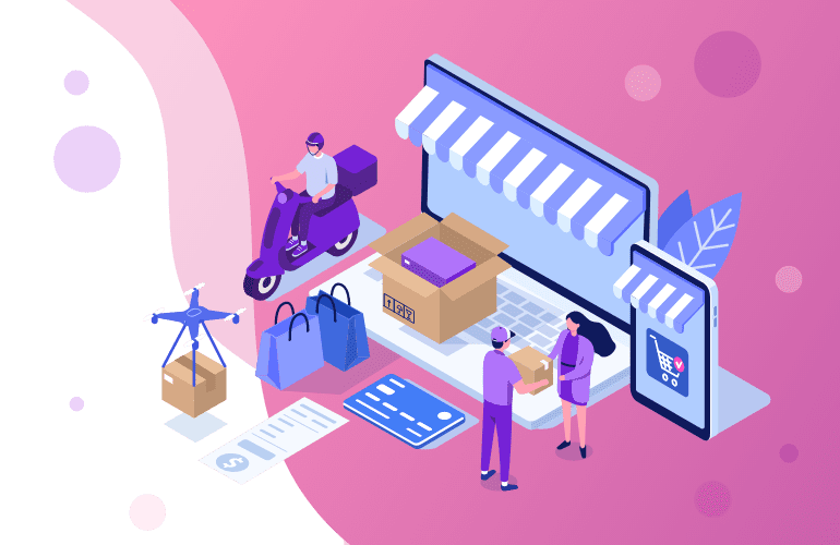
6. Free shipping
93% of online buyers are encouraged to buy more products if free shipping options are available. Offering free shipping will help increase conversion. Online shoppers are beginning to expect choice with shipping options, whether that’s a free shipping spend threshold, free shipping on selected items, or a blanket free shipping policy. Amazon Prime is a big driver of consumer expectations when it comes to free shipping and added value.
The term ‘free shipping’ is of course for the consumer’s benefit. Online retailers can often work the cost of shipping into the price of the products that they sell or, as with Amazon Prime, offer a premium account option, giving consumers the satisfaction of free shipping without damaging margins.
Another related benefit of offering free shipping is eliminating the possibility of price shock at checkout, which can drop conversion rates. Price shock is when a shopper reaches checkout and sees the total price, including shipping, and is put off the unexpectedly high amount. Clearly showing shipping cost with the product price on the product page helps reduce price shock. By offering blanket free shipping you will eliminate price shock completely.

7. Returns policy
Having a clear and generous returns policy can encourage wavering shoppers to buy. The nature of online shopping means that ‘try before you buy’ isn’t an option. But with a clear, well explained and fair returns policy shoppers will feel more secure in their purchase. This can be particularly effective in certain sectors, such as with clothing and spectacle frames: Amazon Prime Wardrobe and Warby Parker’s Home Try-On service are good examples.
The key with returns is to balance offering a painless returns service and not placing a burden on your business. As long as you are upfront and clear about your returns policy, whether keeping it standard or, as with Amazon and Warby Parker, making a feature out of it, so that shoppers are confident about your returns process, helping to persuade them to buy.
A Narvar survey revealed that 96% of online shoppers would shop with a retailer again based on an “easy” or “very easy” return experience.
Final thought
This article has explored some relatively simple actions that can be taken to improve UX and help optimise conversion rates. Sometimes all it takes is the slightest modification to your webstore’s design or to tweak a process to better serve consumers. The key is to identify where pain points might be and then A/B test to establish what works best to optimise conversion rates.
Is your webstore optimised for conversion? Get in touch today for a chat with our eCommerce development specialists to find out how we can help you improve conversion rates, lift sales and grow your online business.