10 ways to write a call-to-action that gets the right results
Whether you’re creating a Google Ad, an email newsletter, or a landing page, it’s vital to get your call-to-action, or CTA, right.
Nail your CTA, and you’re one step closer to getting leads, signups, and sales.
Despite only being a couple of words long, call-to-actions can be hard to create. If they’re too dull, confusing, or just plain uninspiring, there’s the risk that your customers may move on without clicking.
Struggling to write the perfect CTA? We asked our digital marketing experts for their top ten tips. And, of course, if you need a little extra support to craft a call-to-action that gets all the clicks, we’re here to help.
Article topics
- Use numbers
- Keep it short(ish)
- Show there’s no risk
- Create a sense of urgency
- Take advantage of power words
- Don’t be afraid to have fun
- Consider personalisation
- Focus on the customer
- Think about the whole package
- Test, test, and test some more!
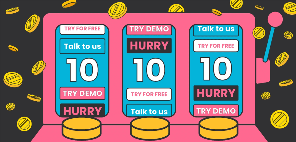
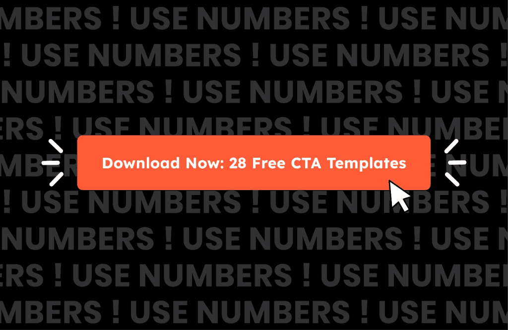
1. Use numbers
Want to make your call-to-action more appealing? Try adding a number into the mix.
Take this CTA from HubSpot. Instead of saying ‘download free CTA templates’, it specifies exactly how many templates you can access by clicking the button.
This gives customers reassurance about what they’ll receive and lets them visualise what they can do with the content.
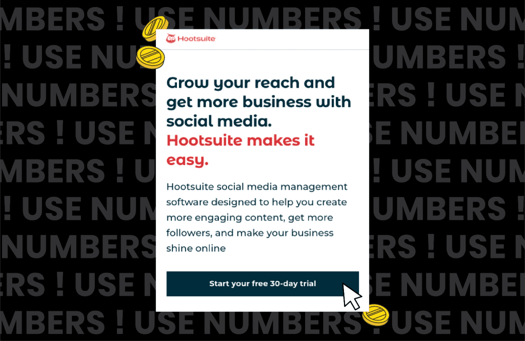
Here’s another example from Hootsuite. This CTA doesn’t just offer a free trial, but a ‘free 30-day trial’.
This provides an air of legitimacy and fosters trust – customers know they’re getting a good offer!
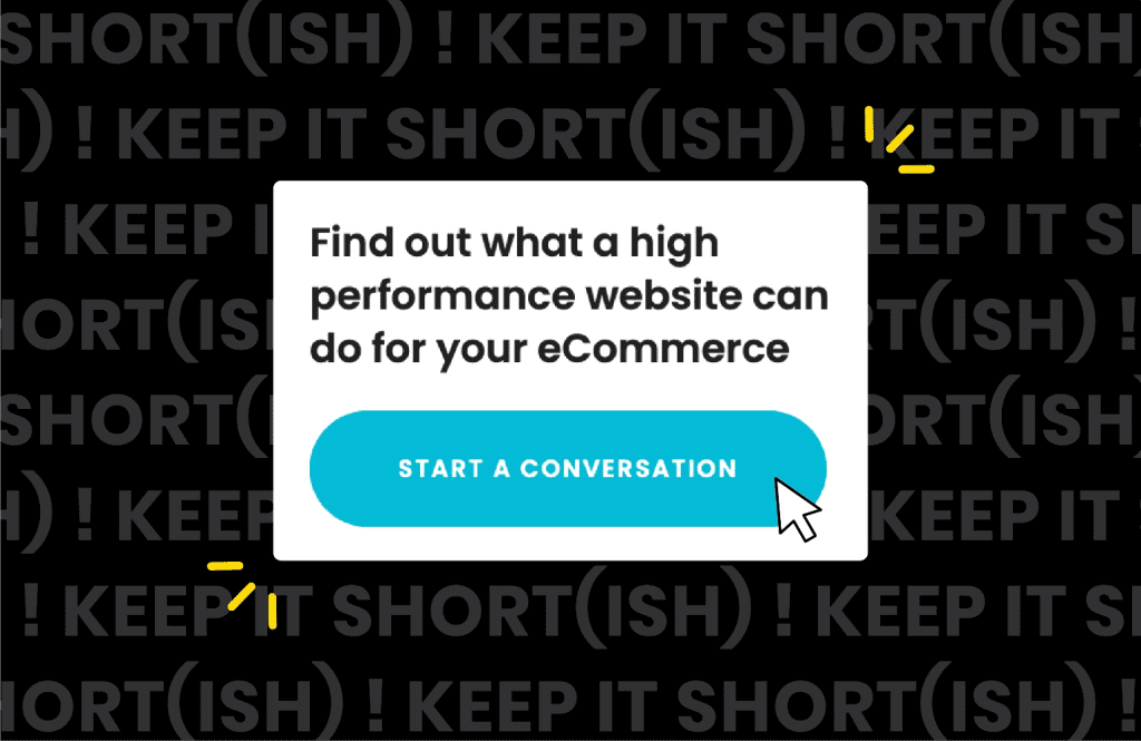
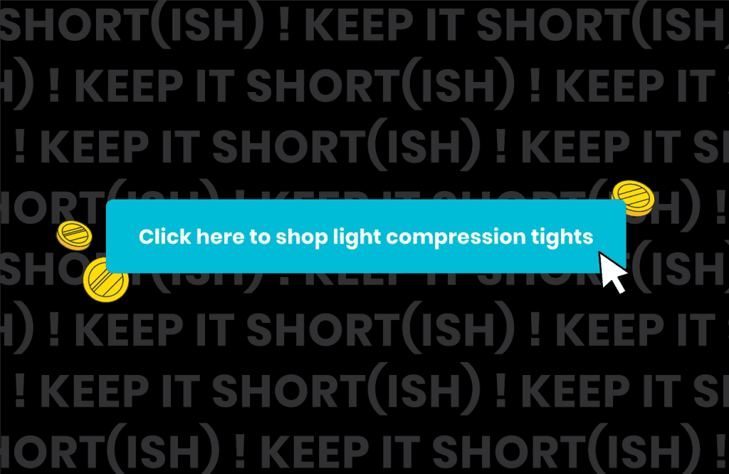
2. Keep it short(ish)
There is a lot of debate over how long a good call-to-action should be. However, most digital marketers agree on the following:
- Customers don’t spend much time reading your CTA, so the shorter the better
- However, one-word call-to-actions generally don’t lead to high conversion rates as they don’t provide customers with enough information
In our experience, two to four-word CTAs provide our clients with the best conversion rates. You can see here that a three-word call-to-action button works well – it’s short enough to be easy to read but long enough to tell customers what to expect.
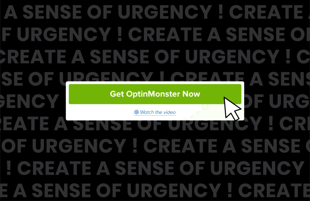
Of course, rules are meant to be broken. There may be circumstances where a descriptive call-to-action that’s longer than normal drives more clicks, like the one below.
Testing can help you identify that all-important sweet spot – we’ll talk more about the benefits of testing your CTAs later.
3. Show there’s no risk
It’s vital to foster a sense of trust and authoritativeness in your marketing copy. The same logic needs to apply to the CTAs you create.
A confident, clear, and credible call-to-action will make your offer stand out and encourage customers to learn more about what you can provide.
Here’s a simple call-to-action that does the job – ‘try for free’. This shows customers they can see if your product or service is right for them before committing.

What else can you add to your call-to-action to show there is no risk? You can:
- Offer a trial or demo
- State no credit card details are needed
- Advise the customer can cancel anytime
- Say you provide a money-back guarantee
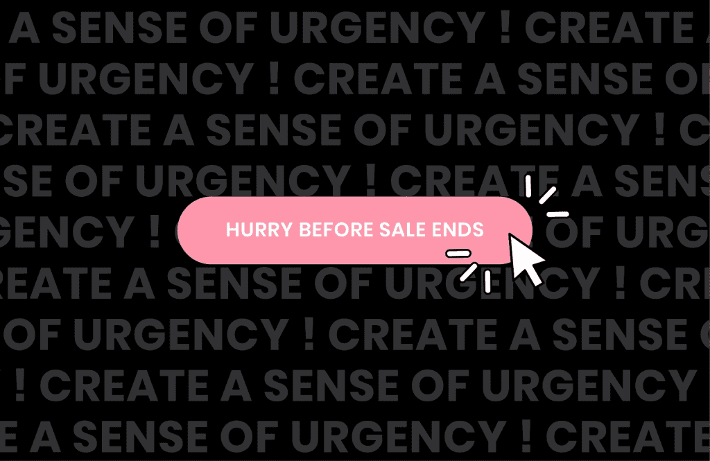
4. Create a sense of urgency
When a customer lands on your homepage or views your marketing email, it’s in your best interest to get them to convert as soon as possible.
You don’t want to risk them leaving your site or, even worse, converting on a competitor’s website.
This is when creating a sense of urgency and invoking the fear of missing out (FOMO) can work in your favour.
Some digital marketers don’t like to create a sense of urgency in their CTAs as they don’t want to appear too pushy or pressure potential customers into making a decision. However, even small tweaks, like adding the word ‘now’ to your call-to-action, can make a significant difference.
Highlighting limited-time offers can also work well and provide a gentle nudge to encourage customers to take action sooner rather than later.
5. Take advantage of power words
Some words are more persuasive than others.
Power words evoke a particular reaction in people, so much so that they can boost your conversion rate by nearly 13%!
Here are some great power words to try in your call-to-actions.
- Decadent
- Discover
- Easy
- Essential
- Forever
- Free
- Healthy
- Incredible
- Kickstart
- Life-changing
- Massive
- Masterclass
- Official
- On-demand
- Thrilling
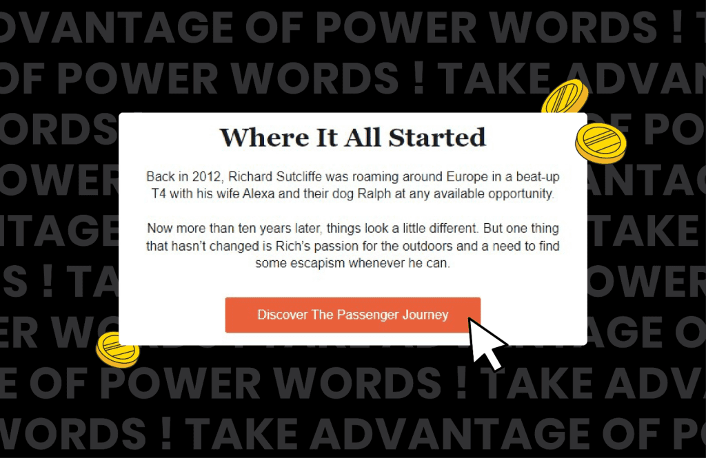
Here’s a brilliant example of a power word in action. Instead of saying ‘find out more about the Passenger journey’, this call to action uses the power word ‘discover’. This evokes a sense of exploration – which works especially well with the Passenger brand.
While power words are great, use them sparingly. Too many can make your call-to-action copy appear inauthentic and overly salesy.
6. Don’t be afraid to have fun
Call-to-action copy doesn’t have to be boring –- adding some personality can grab prospective customers’ attention and get them to click.
Here’s an example we love in an email from Cor Blimey, a clothing and homeware store. Rather than saying ‘shop the range’, it’s opted for the fun and quirky ‘bring me the bargains!’
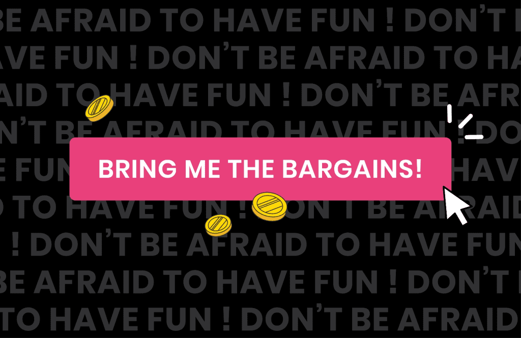
Consistency is important here. Your call-to-action must reflect the tone of voice of the rest of your website copy. Brand consistency can lead to up to 20% more growth and 33% higher revenue for your business.
Is it ever okay to use an emoji in a call-to-action?
It depends on your target audience, what you sell, and the industry you work in.
While an emoji might work well if you operate a clothes store for Gen Zers, it might look out of place if you sell life insurance.
If you do opt to use emojis:
- Use them alongside, not in place of wording
- Don’t use more than one
- Make sure your target audience understands the context of them. For example, Gen Zers tend to see the thumbs-up emoji as passive-aggressive
7. Consider personalisation
Your call-to-action buttons don’t have to be static. You can implement personalisation to make them appeal to prospective customers.
Personalising your CTA copy is a surefire way to get conversions. According to HubSpot, personalised call-to-actions perform over 200% better than standard CTAs.
How can you personalise your call-to-actions?
- By using placeholders that can be dynamically filled with information. For example, if you ask for a first name when people sign up for your mailing list, you can include a name in your email calls-to-action
- By using different CTAs that appeal to different audiences. For example, let’s say you sell vegan cookbooks. Some customers may want to see affordable recipes, while others want to see recipes they can make in a hurry. You can tailor your call-to-actions accordingly
- By changing the CTA depending on whether web visitors are accessing your page on mobile or desktop/ Some platforms like Shopify, Wix, and Squarespace let you create different call-to-actions for desktop and mobile users. For example, you may opt for a shorter call-to-action on mobile
Find out more about the different ways you can personalise your website.
8. Focus on the customer
Here’s an interesting case study from Partnerstack. The company increased its conversion rate by over 110% by changing its homepage CTA from ‘book a demo’ to ‘get started’.
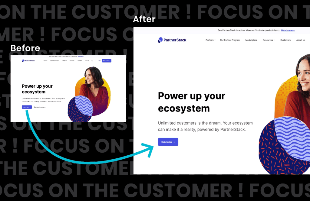
Partnerstack surmised the massive uptick in conversions was because it moved from a salesy call-to-action to a customer-led one.
Your customers want to know how your product or service will benefit them. Ensuring your CTAs resonate with their needs and requirements will lead to improved conversion rates.
Here are a few ways you can do this:
- Identify your customers’ pain points and how you can solve them
- Talk about the benefits of your product or service rather than the features
- Use ‘my’ rather than ‘your’ – a study by Unbounce showed that doing this increases conversions by 27%
9. Think about the whole package
While the words you use are essential, you must also think about the other elements of your CTA. These include:
- The font, size, and colour of the text
- The colour of your CTA button
- The size of your CTA button
- The shape of your CTA button
- Any animations you use on your CTA button
- The location of your CTA
- The text and assets that surround your CTA
Even small changes to your CTA button can drastically affect how many clicks and conversions you get.
How can you identify which elements drive the most conversions? Through comprehensive testing…
10. Test, test, and test some more!
The best way to see what call-to-action copy works on your website? Test it!
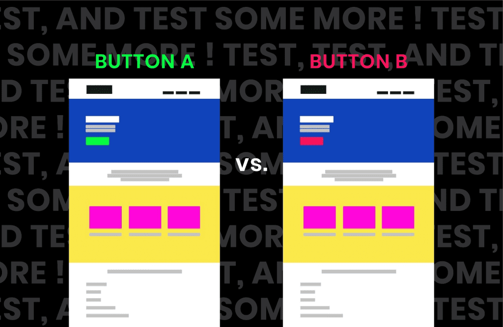
A/B testing is a fantastic way to see which CTAs your customers like best. Here’s how it works:
- Create two nearly identical versions of a page with one thing different. For example, one page can have the call-to-action ‘shop now’ while another has ‘check out our range’
- Send half of your website traffic to one page and the rest to the other
- After a set amount of time, see which page has received the most conversions. This will give you a good indication of which CTA copy performed the best
You can also use A/B testing in the CTAs you use in your email campaigns and paid ads.
Want to supercharge your CTA buttons? Call on Xigen!
Your call-to-action may only be short, but it can significantly impact your page content.
Understand what your target audience wants to see, take advantage of personalisation techniques, and regularly test your CTA copy to ensure you get the most conversions possible.
We specialise in UX design and copy at Xigen. Our specialist team will work to understand your business goals and implement innovative A/B testing techniques to ensure your CTA buttons stand out from the crowd.
Get in touch today and take the first step towards turning website visitors into fully-fledged customers.