Users have been encountering dark UX patterns for a number of years across a variety of platforms
It’s little wonder these deceptive tactics have seeped into the online world though - misleading sales techniques were employed long before the internet even existed.
It’s these kinds of practices which have now been digitised - practices such as negative-option billing.
Xigen co-owner Mark Fitzsimmons, believes it’s important to shine a light on the way old school, old generation techniques have morphed in the digital age:
“It’s the high street and doorstep techniques that have been digitised and brought into our digital world. I think they’re just a little easier to spot now as people are using the internet more often.
In experiencing the right way of doing things, people are a little bit more savvy when they start to see Dark UX Patterns and I think that’s what puts them off.”
Mark Fitzsimmons
Operations Director, Xigen
These patterns have been used on the internet by companies for many years now, and the reason? Money. Revenue is king and dark patterns often occur as a result of the targets to retain customers and convert sales.
The term ‘Dark Pattern’ was coined by London-based designer Harry Brignull in 2010 and he has since been on the path to highlight and document cases of dark patterns in UX. He set up the site darkpatterns.org and also a Twitter account with the tag line ‘exposing deceptive user interfaces since 2010’ to shine a light on these underhand methods of design. With the increasing prevalence of these deceptive practices, no one in the digital age will ever go without encountering some form of dark pattern online.
As designers with strong ethical values, transparency and best practice constantly at the forefront of everything we do, we’re fascinated with the concept of dark UX patterns. That’s why we’ve created this report. With the help of expert opinions and exclusive user data we’re delving into what dark patterns are, examples of these techniques and what they mean for companies using them.
What are dark UX patterns?
In simple terms, dark patterns are deceptive designs. The practice of using dark patterns in websites, apps and mailers is carried out with the intent to make users do things they didn’t mean or want to - and limit their choice to act how they actually want.
These tricks are implemented to take care of the objectives and targets of the company without taking into account the experience, needs or even the ethics of the user.
It’s highly likely that many, if not all, internet users have encountered some form of manipulative design patterns, whether they’ve realised it or not - and designers will certainly be particularly attuned to spotting this sort of practice.
In order to shine a light on dark patterns and what people think of them, we commissioned an exclusive survey of over 1000 people. From our exclusive data we’ve discovered that one in five people (23%) have experienced issues when trying to unsubscribe from a brand’s service online alone. Digging a little deeper into age categories, a third of 16-24 year olds and 25-34 year olds have experienced issues when cancelling from online services.
It’s not just unsubscribing that’s a problem for online users, there are many different types of dark pattern and they’re all used in a variety of ways. In fact, once you understand how many techniques are used it shows you’re almost certain to encounter at least one on a daily basis, even simply by opening your email inbox.
Dark pattern types
On his quest to call companies out on the use of dark patterns, Harry Brignull has identified 12 different types to assist users in spotting these techniques. The following are misleading interfaces many consumers will encounter every single day:
Trick Questions
In this instance, users could be filling in a form and be fooled into offering an answer they didn't intend to. This kind of practice is quite old school and takes advantage of busy users who scan-read websites or emails. Questions are worded in such a way that if they're scanned, rather than thoroughly read, they appear to ask one thing rather than something quite the opposite.
Sneak into Basket
As a customer on a website, have you been shopping and put something in your basket, gone to check out and noticed an additional item in there you didn't?
This is when somewhere along your journey to purchase your intended item, the site has snuck something additional into your basket - Brignull says this is usually through an 'opt-out radio button or checkbox on a previous page.' Thanks to the Consumer Rights Directive, this dark pattern is illegal in the UK and a number of EU countries.
Hidden Costs
Quite similar to a 'sneak into basket' is the dark pattern of hidden costs. How often have you gone to pay for something online and the price has increased far more than you were expecting when you reach the final stage? This is because when you reach the very last step of the checkout process, additional charges have been added on top. These are charges such as tax and delivery costs.
Roach Motel
Brignull describes this as a situation in which you can get yourself into very easily, but can be extremely difficult to get out of. An example of this is attempting to unsubscribe from a company's services - something such as a premium subscription.
This is such a common technique employed that our exclusive data revealed over two thirds of people (68%) think that brands purposely make it difficult for users to unsubscribe from their services online.
Privacy Zuckering
All users of social media can probably guess what (or who) inspired this particular type of Dark Pattern. The term is named after Facebook CEO Mark Zuckerberg and this is when you are duped into sharing more information than you consciously wanted to on a public platform.
Price Comparison Prevention
This is where a retailer purposely makes it difficult for the consumer to be able to compare the prices of similar items. Often this is used to make it particularly hard to compare the price of a single item with a bundle of that item. This limits your chances of being able to make a decision based on the full facts.
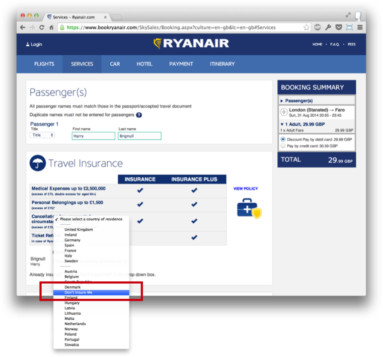
Misdirection
Mainly used when the customer is looking to buy something, such as a flight, misdirection is often used for deceitful upsell purposes. The design of the site ensures attention is focused on one thing to completely distract users from something else. Think add ons such as travel insurance or paying for a seat when you're going to be assigned one regardless of whether you part with cash for it or not.
Bait and Switch
In the traditional sense, ‘bait and switch’ is the act of promoting an item which seems to be value for money with the intention of 'switching' to something more expensive. A ‘digital bait and switch’ Dark Pattern forces a user into something they hadn't intended. They think they're doing something but instead an unwelcome outcome occurs.
For instance, when a pop up appears, users click cancel on the X if they aren't interested in what the pop up contains. However, in this case, rather than do what the user intended - which was to cancel - clicking that X instead takes the user through to what the pop up was advertising. Interestingly, 42% of people told us that pop-up ads are the most disliked website feature.
Confirmshaming
This style of dark pattern is all about the wording used. Have you ever been on a website or been sent an email and upon trying to decline or opt out, you're greeted with a passive-aggressive passage of text aiming to make you feel guilty? That's confirmshaming. The wording is written in such a way to make the user feel shamed into complying.
Disguised Ads
The classic kind of disguised advert is designed with a 'download now' button when there's actually nothing to download at all. This deceptive practice disguises content or a different navigation as something entirely different.
Forced Continuity
When a customer signs up for a free trial with a service, naturally they would expect that to come to an end when the trial term completes. Forced continuity, however, is when you start getting charged without warning after the free trial has ended. These are often difficult to get out of.
Friend Spam
This is when users are asked for personal details (social media access or email address) under false pretences. In this instance the product then sends spam messages to the users contacts claiming to be them.
Examples of dark UX patterns
Each dark UX pattern comes with varying levels of ethical concern. We’ve pulled together a number of dark pattern examples to help designers question the ethical viability of implementing these into the fabric of a website.
LinkedIn’s settlement
Arguably the highest-profile example of a dark pattern being called to account is the case of LinkedIn. In 2015, the social media platform, which is aimed at professionals, was ordered to pay $13million in a lawsuit settlement due to its sign-up process and ‘Add Connections’ feature. LinkedIn used the ‘friend spam’ dark pattern to harvest contacts from email accounts and sent messages to those contacts appearing to come from the user.
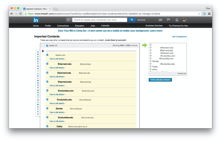
The lawsuit concluded with members of LinkedIn’s ‘add connection’ programme between September 2011 and October 2014 being eligible to submit a payout claim. While this didn’t result in much compensation per person (about $10 each, in fact) it stands to prove that using dark patterns can result in hugely negative effects for a business. The reputational damage, indeed, was probably greater than any we can measure financially.
Other examples of dark patterns in action
- High profile airlines have been known to add extras on their upsell pages but use deceptive design to trick users into thinking it’s an essential part of the process.
- Some websites (more famously hotel websites) attempt to increase the urgency of a purchase. They achieve this by popping up alerts in bold colours, mainly red, featuring information such as how many rooms remain for each hotel in order to panic users into booking.
- It’s been known for sites to place items relevant to what you’ve already added in your online shopping basket.
- If a user has subscribed to a website’s services and they want to unsubscribe, there’s a multi-layered dark pattern in play for the customer to navigate before they can find an option to do so. Often a user isn’t able to unsubscribe themselves even when they reach this stage and the company retains control.
- When it comes to unsubscribing from spam emails, the font and colour of the unsubscribe link text can often be altered to deceive the user. As with the nature of personal emails, users often skim-read and will more often than not miss this link.
- When users go to donate to a charity online, they’ll often be presented with a pre-selected donation option instead.
- Adverts have even been known to be designed with a speck of dust or strand of hair over the top in the hope the user will try and brush it away, and ultimately click through to the product page.
The Dark Patterns.org website and Twitter account are both regularly updated with the latest deceptive designs spotted from across the web and are worth following to get an understanding of the latest techniques that aim to use design to deceive.
Should dark patterns be regulated
Our exclusive data also shows that no one in Scotland thinks these dark pattern practices should be legal. A huge 75% believe it should definitely be illegal and the other 25% think it should ‘possibly’ be illegal.
This is the user experience in reality. A staggering 90% of people actually think that the ‘Roach Motel’ dark pattern should be illegal. So you can be as close to certain as possible that if you’re employing dark UX within your website, your users are unhappy about it.
Reacting to these numbers, digital design expert and Xigen co-owner James Pruden commented:
“I think customers feel so strongly that it should be illegal because they don’t have any other option. Because there isn’t a strictly enforced web governing body, as it were, the only place they can go is down the legal route.
More than 90% of
people in the UK
believe that it
should actually be
made illegal for
brands to purposely
make it difficult to
unsubscribe to
online services.
“So if dark UX were to be made illegal they could take action against brands that weren’t playing fair. It shouldn’t need to get to that, though, it’s disappointing that it’s got that far.”
The unfortunate thing for these disgruntled users is that dark patterns are extremely difficult to regulate. Back in 2014, Harry Brignull explained the differences between SEO regulation and that of UI to an audience at the UX Conference in Brighton:
“With SEO, the Google bot can pass the source code of every site on the web, so SEO is implemented at a source code level and the Google bot can detect it, so it’s passable.
“With UI design on the other hand, you implement the UI design at a source code level but it occurs at the level of human psychology which is a whole level above and bots can’t work like that at the moment.”
“Maybe in 50 or 100 years we’ll have bots that can mimic human cognitive fallacies but right now that doesn’t happen.”
Harry Brignull
“So we can’t detect back hat UI automatically in the way we can detect black hat SEO. So in the case of SEO, well the reason why they’ve got that big line between the two (black and white hat SEO) is because they get detected very easily and get punished. In terms of black hat UI design, well no one’s really going to catch you very quickly and you won’t get penalised very hard either.”
Brignull believes the industry needs a simple and clear code of ethics to refer to in all instances. In addition, the Consumer Rights Directive has actually already rendered some dark patterns - such as sneak into basket and aspects of hidden costs, forced continuity and bait and switch - illegal. The more these laws are introduced, the less viable it will be to implement deceptive interfaces on a site.

The effect of dark patterns on brand reputation
Companies using dark patterns are treading extremely dangerous ground when it comes to their brand reputation. Especially considering we’ve discovered that 60% of people would be unlikely to return to a website after a bad UX experience.
If a brand knows it’s going to develop a bad reputation because of implementing dark patterns within the design of the website, why still do it? Why do brands purposely use dark UX patterns? James Pruden thinks it’s because it’s a simple shortcut:
60% of people would be unlikely to return to a website after a bad UX experience.
“It’s often the easiest route in order to retain customers and is a bit of a cheat. It’s really easy to implement, it’s really well documented and there’s lots of examples out there in order to copy.
“But, actually, to have a real quality user experience it’s so broad, it touches so many parts of the customer journey that it takes a lot of time, a lot of effort and a lot of thought to ensure that your whole service offering is up to par.
“Let’s face it, if people are trying to leave, it’s because they’re unhappy. It makes no sense to try and trap them into your service, what makes more sense is to improve your service to the point that people do not want to leave. Trying to retain them is harder than hiding the cancel button.”
“Let’s face it. Trying to retain Ecommerce customers is harder than hiding the cancel button.”
James Pruden
Managing Director, Xigen
James makes the case that dark patterns are, ultimately, pointless. He said:
“For me, it just shifts the problem elsewhere. If a customer is disgruntled and wants to leave your service and they go to cancel it online and they can’t, then they’re going to get on the phone.”
“Not only are they disgruntled by the service, they’re now disgruntled by the cancellation policy. So actually, you’re not stopping users, and from a stats perspective. When ‘Head of Marketing’ or ‘Head of Online’ looks at their statistics and says: ‘wow, online cancellations have gone down by 80% because we made this hack on the website’ they also need to take into account telephone cancellations.”
“Have they gone up and are people more irate? Therefore is your employee satisfaction going down in that department as well?”
“People don’t want strings and therefore retailers have responded by cutting those strings but are making it really hard to cancel. So they’ve shifted it off elsewhere, but in my view they’re just going to shift that problem either through social channels or on the phone.”
“You’re either going to have disgruntled people on Facebook or disgruntled people on the phone to your customer support centre.”
There are so many reasons that customer satisfaction is important to any business. It reduces the chances of negative word of mouth, increases the value of a future relationship with a customer and it’s actually cheaper to retain a customer than gather new ones.
It’s fascinating, therefore, that so many businesses are willing to compromise on customer satisfaction, considering it’s such a huge part of any business model.
The more users are pushed, the more public the problems are eventually going to become. Deceive customers to the point of enraging them and they will take to social media to complain. Social media has the power to spread messages and take things ‘viral’ in a very short space of time and can damage a brand’s reputation in little to no time.

How do cities compare when it comes to dark patterns?
Digging a little deeper into the user experience of dark patterns and their use, we’ve delved into our UK-wide data to see how attitudes to deceptive practices differ across the country. The results have revealed which city is the least forgiving when it comes to poor UX experiences, who dislikes pop-up ads the most and the least confident city when it comes to UX improvements.
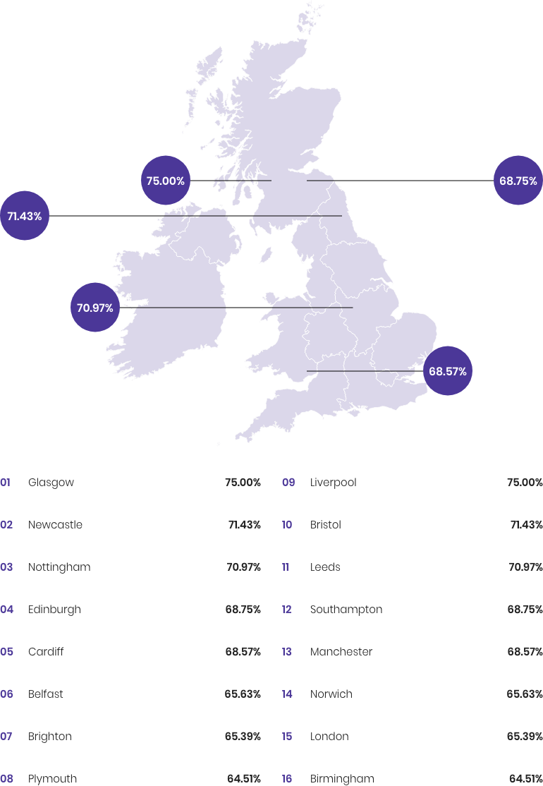
Which city is the least forgiving after a bad UX experience?
Companies targeting online customers in Glasgow, Newcastle and Nottingham should keep honesty at the forefront of their interface choices. A huge 75% of people in Glasgow would be unlikely to return to a brand after a bad experience with their UX - that’s a high volume of customers companies stand to lose if they observe poor design practices.
Although just over 60% of people in Bristol are unlikely to return to a brand after a bad experience with UX, a higher percentage are aware of issues with dark patterns. A huge 84% of people in Bristol believe that brands purposely make it difficult for users to unsubscribe from their services online to some extent.
Despite almost one in three (30%) people in Southampton having had issues unsubscribing from a brand’s service online, they’re the 12th city most unlikely to return to a brand after a bad UX experience.
Least Forgiving City After Bad UX Experience
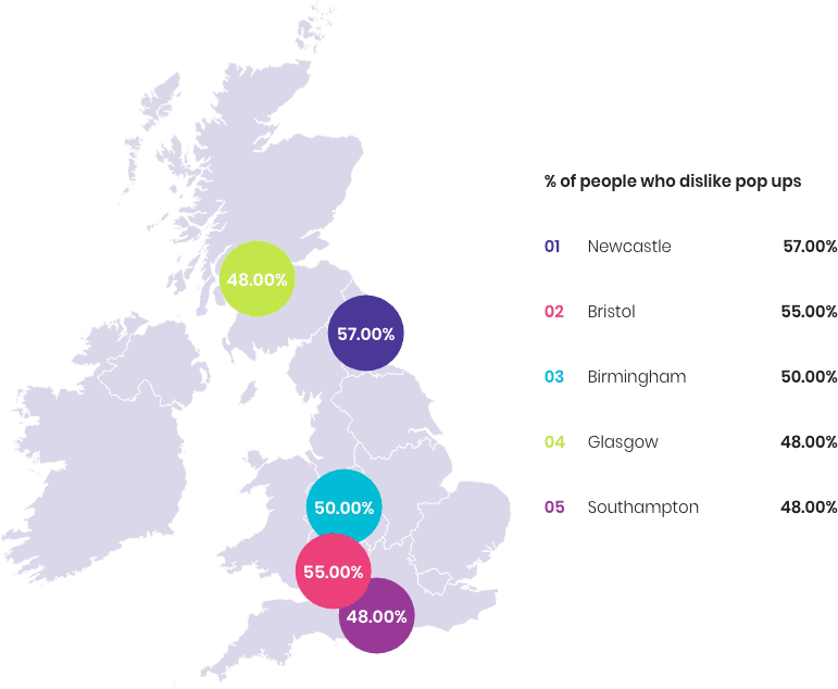
As with the least forgiving cities, Newcastle is once again among those who feel the most negative about poor UX experiences, with 57% of people in the city hating pop up ads.
Which City Hates Pop-Up Ads The Most?
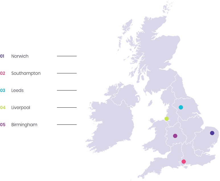
London doesn’t feature on the top five list of least confident cities when it comes to development improvements to UX. That’s because a third (33%) of people in the capital feel that new website developments are actually helping to improve UX. It’s in the East Anglian city of Norwich where people are the least confident in development improvements.
Which City Is Least Confident In Developments To Improve UX?
When it comes to experiencing issues with mobile UX, it’s people based in Yorkshire who are most likely (33%) to experience this, while people in the North East are the least likely (22%).
GDPR issues
The buzz-acronym of 2018 was certainly ‘GDPR’. That’s because the European law - General Data Protection Regulation - came into play in May 2018. This law was brought into force to protect personal data as a fundamental right of all citizens.
This was something that all digital platforms needed to observe and aimed to put an end to pre-checked options or hazy user consent - moving instead to an era of privacy by default.
Despite this, in the age of GDPR our exclusive data reveals that almost half (48%) of people are still finding that they’re being signed up to company emailing lists without their permission. That rises to 60% of people aged 23-38.
Over half (54%) of people in London are also still getting added to company emailing lists without consent, too. But how is this being achieved with GDPR rules?
Through the use of dark patterns such as trick questions, deceptive formatting or even Privacy Zuckering, companies could be attempting to get around GDPR rules.
What is clear, though, is that companies need to be extremely careful with using deceptive dark patterns to obtain their customers’ data. These regulations state that the consent of user data collection needs to be given freely, it needs to be informed and specific and also without ambiguity. In other words, if you dupe someone, you place yourself at serious risk of breaking the law.
Are dark UX patterns affecting age brackets differently?
When we think of dark patterns, the natural assumption would be to think that the younger a user is, the less susceptible they’ll be to trickery. But is this always the case?
It may not always be a rule to live by, because as we’ve already established, 60% of Millennials are still being signed up to company emailing lists without their permission, even after GDPR was brought into force. This means they may be falling foul of deceptive interfaces - but might also just reflect the nature of the sites used by this age bracket.
60% of Millennials are still being signed up to company emailing lists without their permission
Despite this, the age bracket spanning 16-34 are the most confident that new website technologies will help improve user experience. This may be because they work more often with these technologies and understand them the most. It might also be the naivety of youth.
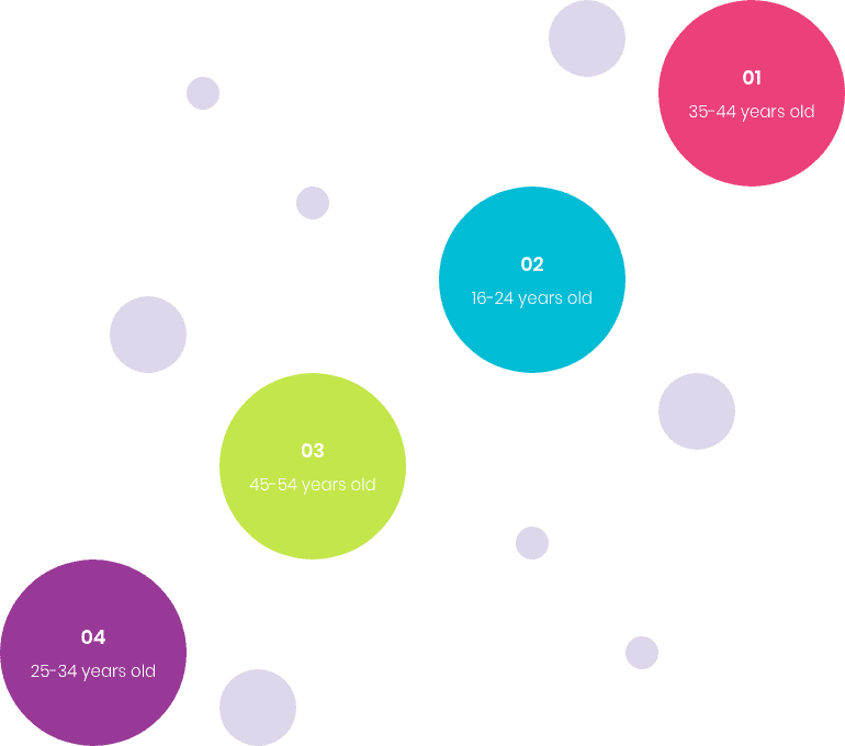
Which generation experiences mobile UX issues the most?
Navigating websites, email and apps on a mobile phone can be a completely different experience to using a desktop or laptop. Therefore, it’s useful to consider how many users go through UX issues when using a mobile version of a site.
Our survey shows it’s the 35-44 category who come out on top, with 16-24s following them in second position. The 45-54 age group are in third position - but it is tricky to tell if they are more tech savvy than the other age groups or just that they use their phone more traditionally.
In short, using dark patterns to trick users is unethical. While companies may appreciate this, many also feel dark patterns help them hit their targets and make them money. But have they considered the long-term impacts of using these underhand interfaces for their business? Honesty, transparency and improving services offered in the long term is a far more feasible option for any brand, especially in the race to win long-term customers who make repeat orders.
In fact, over a third (36%) of people feel that honest terms and conditions are the most important things a website needs to provide. In making customers disgruntled, tying them into a service they’re no longer happy with or deceiving them into decisions they don’t want to make can seriously damage the reputation of a brand.
Is that how companies should want to be operating? Mark Fitzsimmons certainly doesn’t think operating with dark patterns is a sustainable option:
“Long term, this is just really not where you want to be in business. In the world of our internet and awareness of the right way of doing things online, it’s got to be a lot more subtle. There’s a big difference between a user journey in a positive way and a user journey in a dark way.
“Some clients who don’t perhaps have any experience around the subject might instantly want us to guide their customers in a certain way. It needs agencies like us to make it clear that this isn’t the right way, explaining that customers are savvy, that they will spot dark patterns and that it isn’t the right way to go about things.”
Which Features Are Most Important For A Website To Provide?
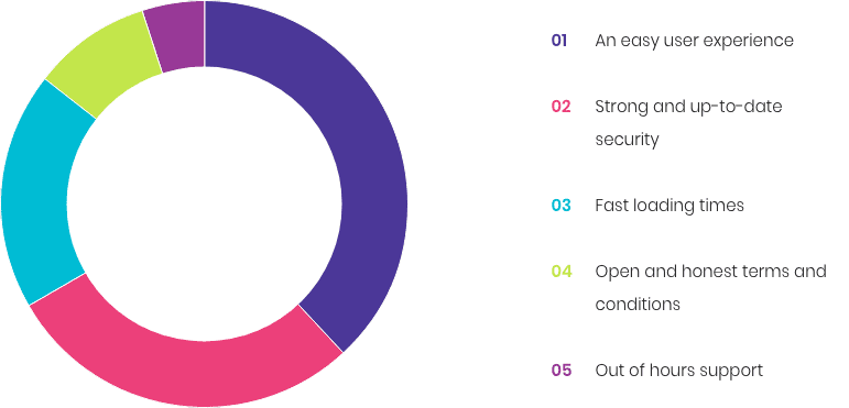
An easy user experience and open and honest terms and conditions feature within users’ top website features. Consumers are increasingly seeking transparency, and if they’re being constantly deceived as a result of a website’s services, they will look for an alternative option.
Almost half of people (47%) said that they would never want to interact with a brand again after experiencing unsubscription issues.
The more discerning customers become, the less they will accept deceiving design and therefore seek honest online options - Mark explained:
“As soon as they sense something’s not looking right, there’s a lot more choice online and you’re not forced to go that route with that website. So they can say ‘no I’ve had enough of this, I’m off elsewhere’.”
The short-term gains obtained from using dark patterns can be tempting, even desirable, but will almost certainly lose a business customers in the long-term. Develop the product on offer to ensure it’s of the optimum quality and always practice honest design because, as James explained:
“If somebody wants to leave, then let them leave. Let them miss you and come back.”
Key Takeaways
- There are 12 different types of ‘dark pattern’ - The term was coined by Harry Brignull back in August 2010 and refers to deceptive interfaces intending to make users do things they didn’t mean or want to. Brignull identified a dozen such practices.
- Implementing deceptive interfaces simply shifts problems elsewhere - If a customer can’t unsubscribe from a service online, they’ll pick up the phone or take their frustrations public via social media channels.
- Trying to retain a customer is harder than hiding the cancel button - BUT it makes more sense for the sustainability of a business to improve the service so that customers do not want to leave.
- A staggering 90% of people actually think that the ‘Roach Motel’ dark pattern should be an illegal practice - You can be almost certain that if you’re employing dark patterns within your website, your users really aren’t happy about it.
- Astonishingly, almost half of people are still being signed up to company emailing lists without their permission - even after GDPR came into force and made this illegal. Stay within the law, keep your customers happy and abandon any ambiguous or deceptive tactics.
- Users are becoming less likely to tolerate dark patterns in their online experiences - Almost half of people said that they would never want to interact with a brand again after experiencing unsubscription issues and 60% of people would be unlikely to return to a website after a bad UX experience.
- Implement user-friendly experiences and put the effort into improving services to create customer satisfaction - customers rank an easy user experience and open and honest terms and conditions among their most valued features for a website.